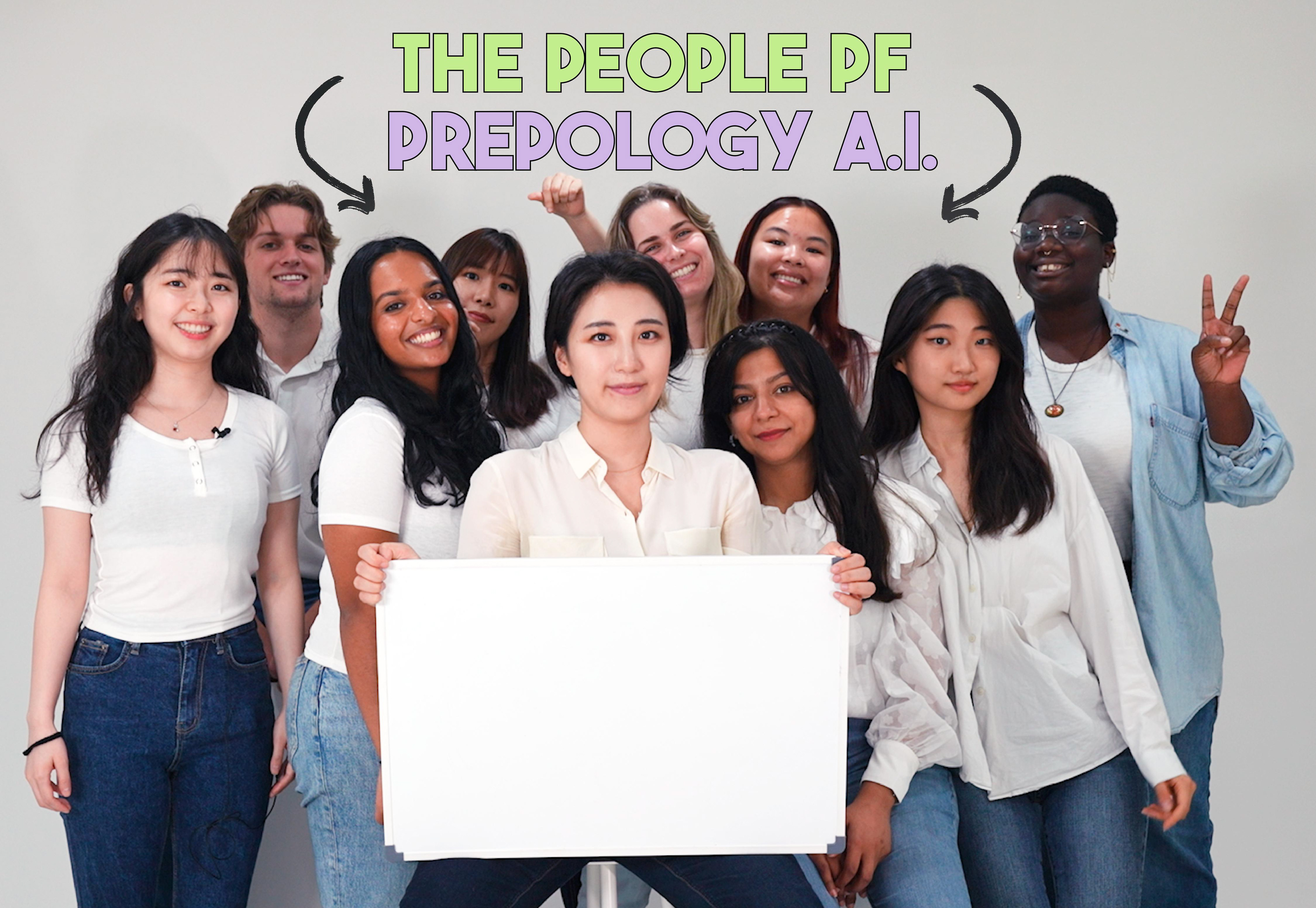
During the summer of 2022, I was an Associate Designer intern at an A.I. edu-tech startup in Seoul, South Korea. The startup, Kokkok Lab, was beginning to expand into the U.S. market under the name of PinchPoint. I was their sole Associate Designer.
My task was two-fold:
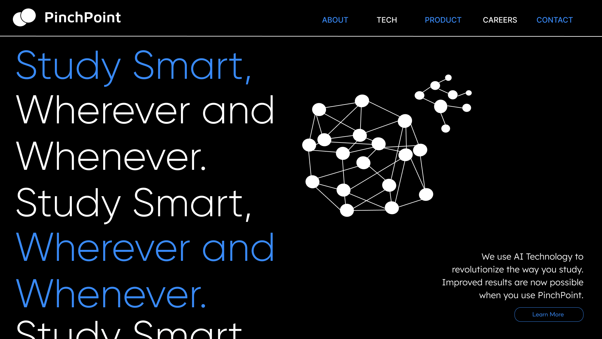
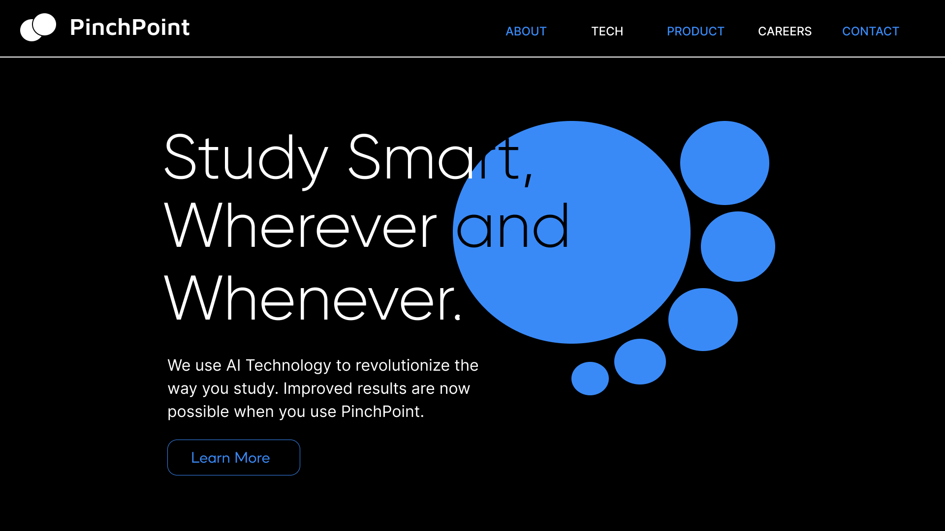
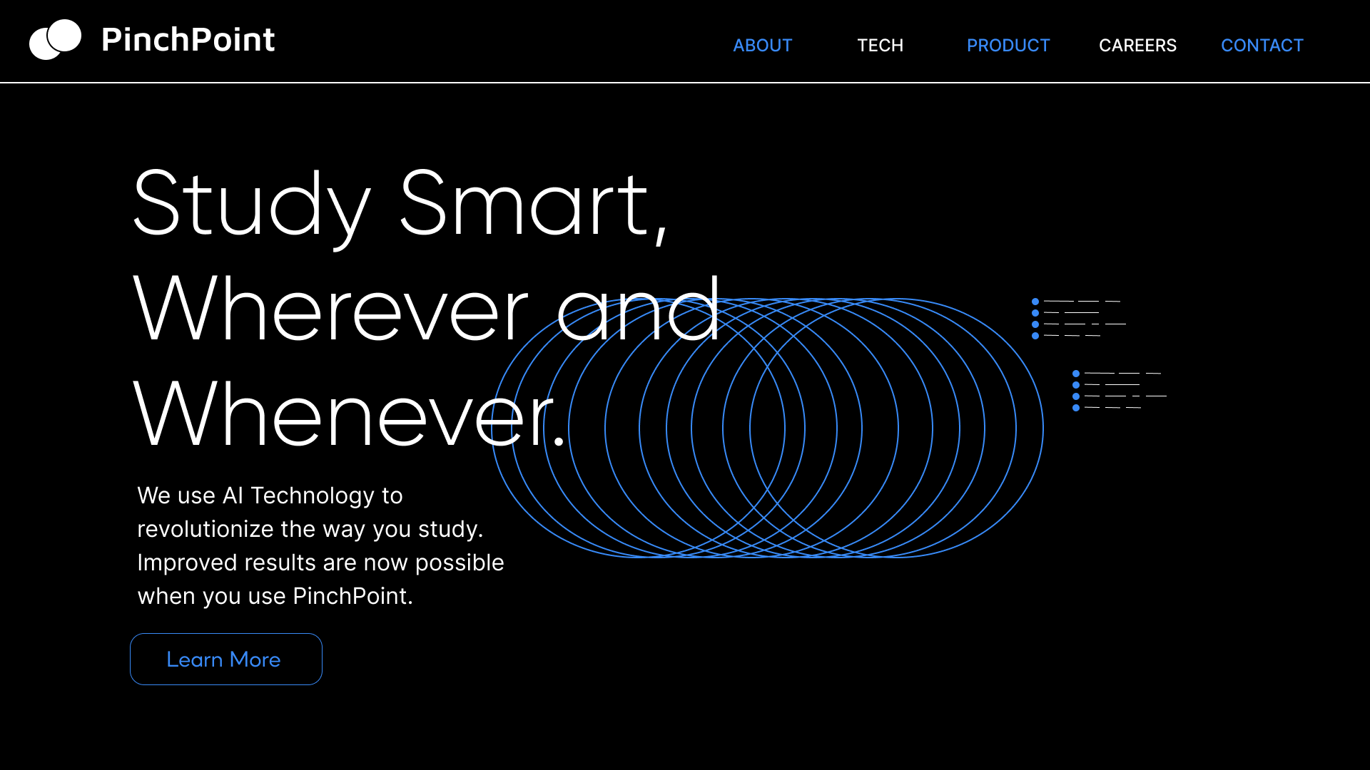
In the first half of my internship, I was tasked to design the homepage for their new company website. The aim of the website was to introduce the company to overseas users in a way that was visually striking and compelling, while still being functional enough to inform users of the company. In the end, I was able to make 3 designs that could be shipped off to the developers for an interactive, motion-led website that had an appealing aesthetic while still being understandable for users.
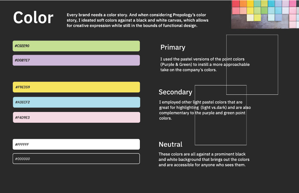
During the second half, I was tasked to form a company brand identity and create social media templates for their expansion into the U.S. market. For this task, I took time to create visual motifs and colors that I felt represented the edu-tech aspect of the company in an accessible way. I was able to ideate and construct a brand identity that set the company apart from its competitors in the edu-tech space through my thoughtful use of color and customizable imagery.
- Figma
- Google Teams
For the website design, I used thin serif fonts, streamlined creative layouts, and simplistic line graphics with one clear point color. I used high contrast of black and white while still maintaining the industry standard color of blue in the technology space. I also wanted the company's slogan to be the focus of the homepage with the largest sized font, in order to differentiate it from other competitor companies.
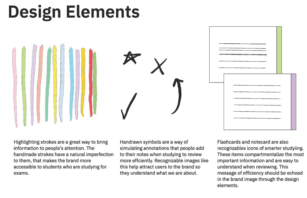
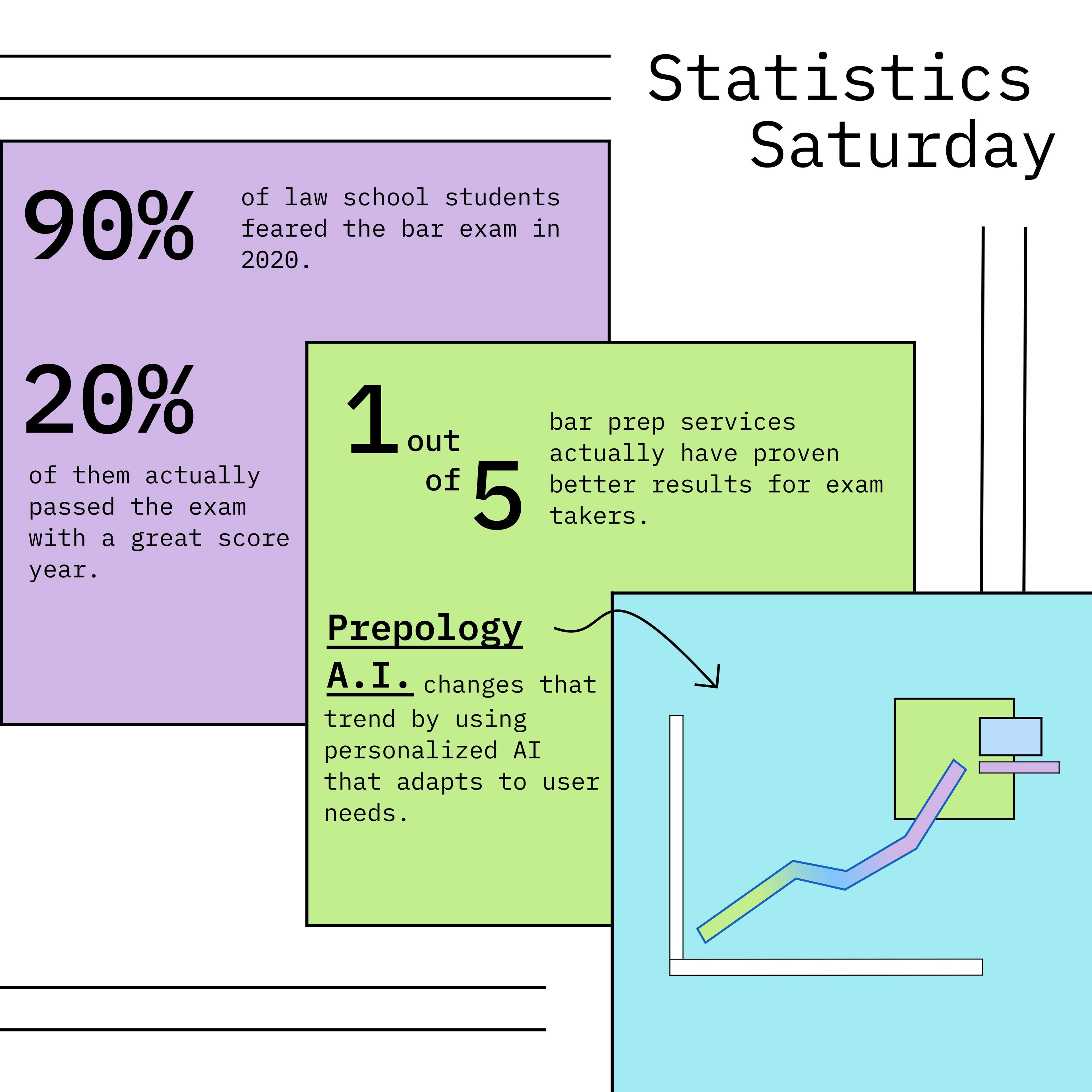
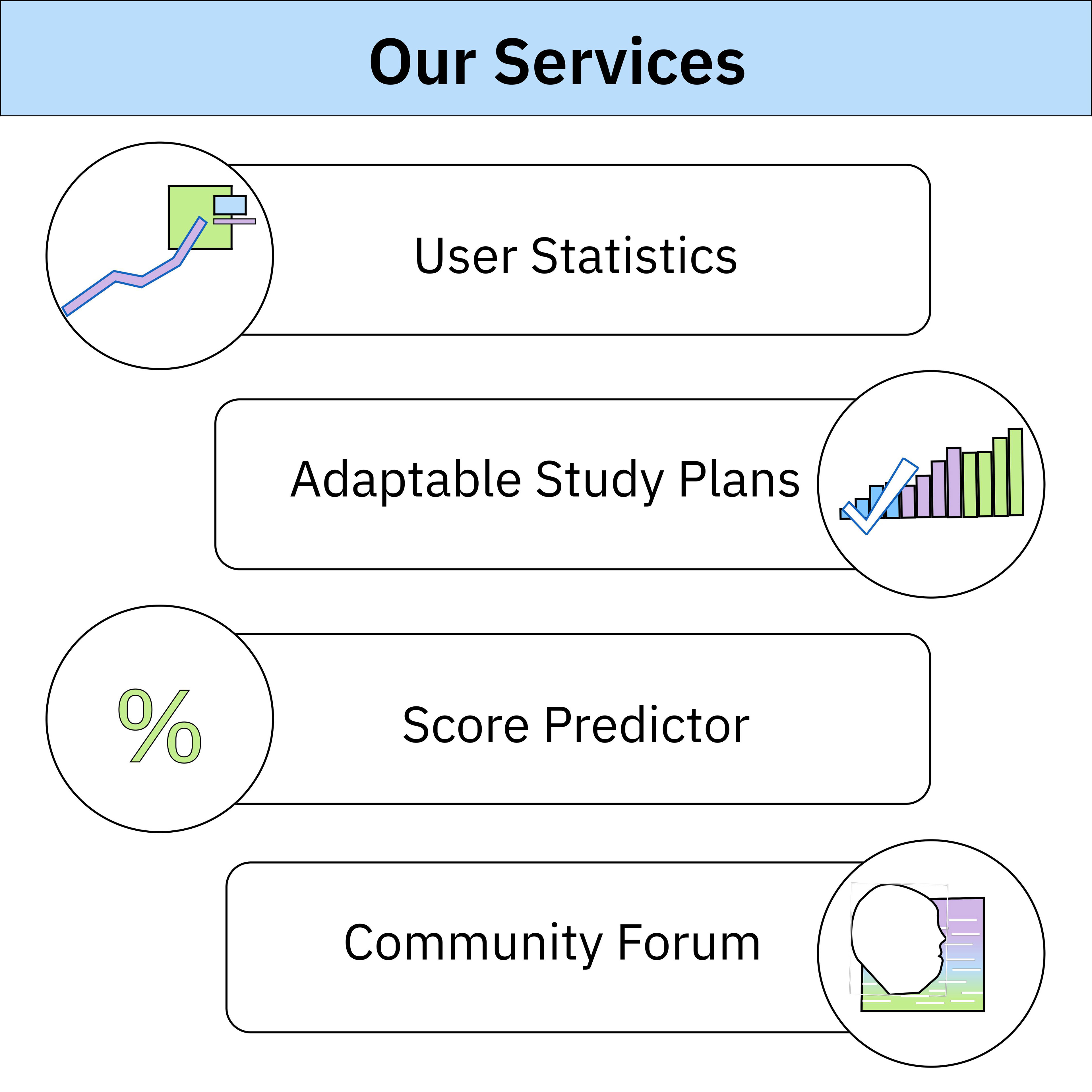
For the brand and social media design, this meant using light, pastel colors that reflected the playfulness of the company while still being a recognizable palette, similar to the color of Post-its and highlighters that many students use to study. Below, you can see the design elements and color palette I created as well as the social media templates I used to employ those elements.
At first, I made some initial designs based on my minimal knowledge of the edu-tech space and had a lack of understanding of the company's goals and mission. As time went on and I continued iterating on my designs, I was able to speak with my design manager and compile references of other U.S. based edu-tech companies. This enabled me to make more informed decisions for the visual design of the website.
It was my firstd esign internship and I was thrown into the metaphorical frying pan with it being a fast-paced start-up. I was the only associate designer on the team so I relied on my product manager to give me guidance and answer my questions. I am glad I was able to see all the ways I could be a designer in a tech-startup in a manner of months. It exposed me to what I wanted and dind't want to do in future positions.
