At Apple, I was specifically working on ASPEN, a project that was meant to give more power to creators on Apple user facing platform’s of Apple Music, Apple Podcasts and Apple Books. This project was in the early stages of production and ideation so I was at this pivotal point to shape what ASPEN could become for users.
As a UI Architect intern at Apple, I had the unique opportunity to work on a new idea and further develop its identity through the work of information gathering, information architecture, and visualizations.
I came into this role with one primary mission: explore what this project can become for its users—with their experience being at the HEART of every decision. My work took a lot of shapes and forms over time, but each iteration gave rise to a new way better way to design for users.
- Miro
- Sketch
- Box
- Adobe Photoshop
- Keynote
I wanted to think about all the steps of the user experience in my ideation, from understanding information, organizing it, and presenting it clearly through diagramming and mockups.
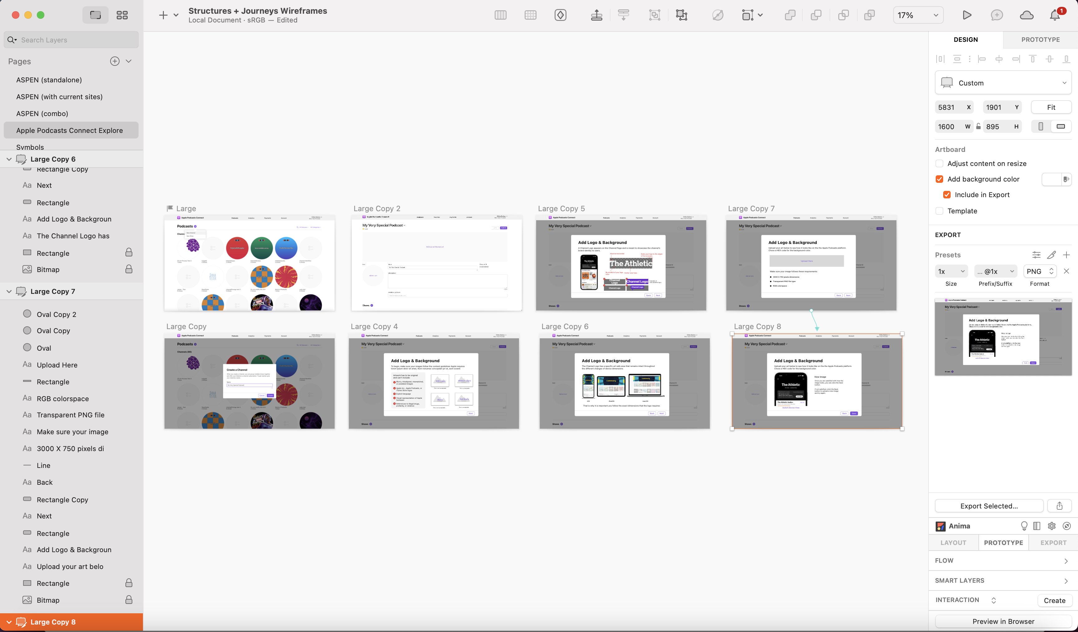
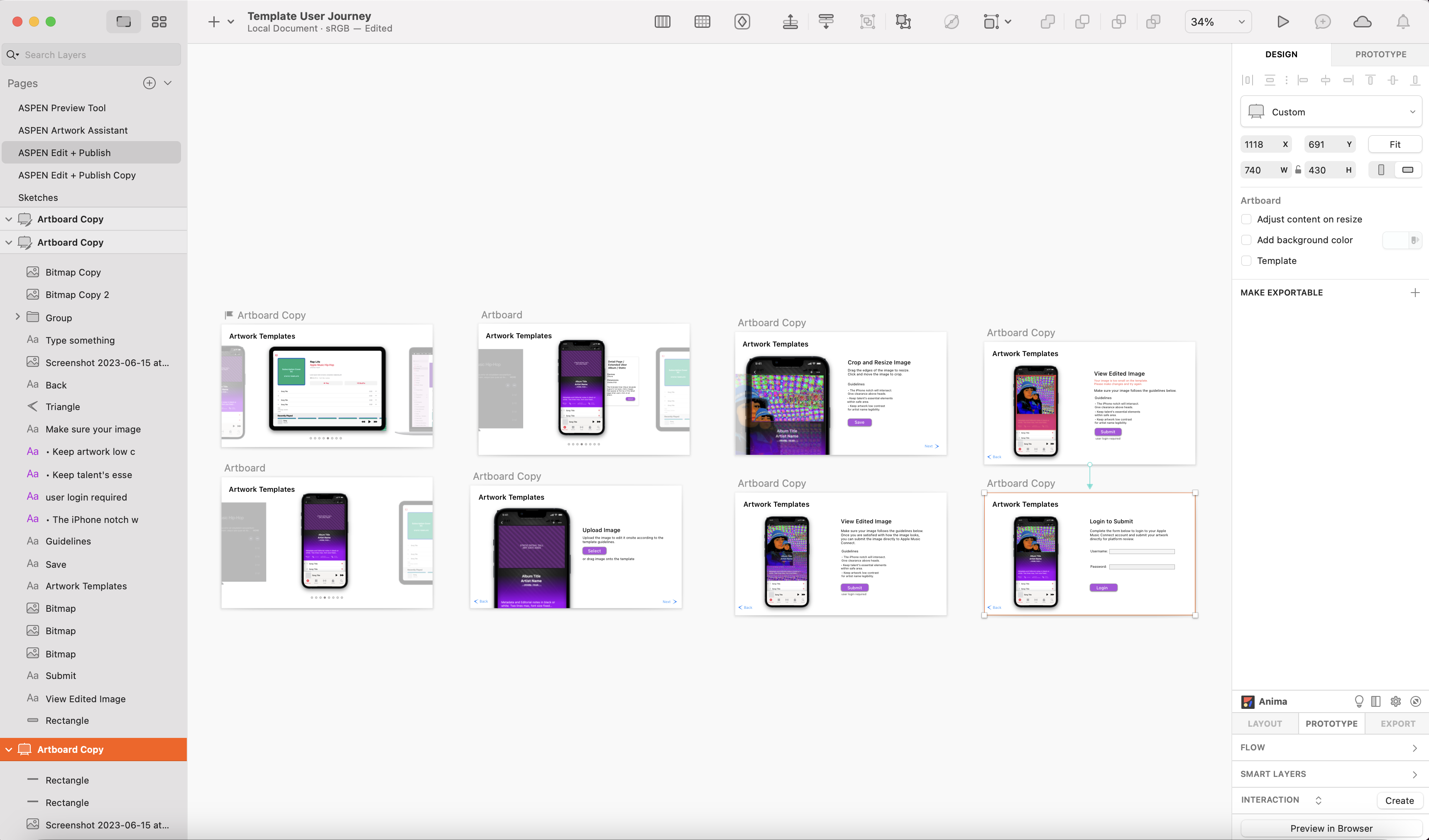
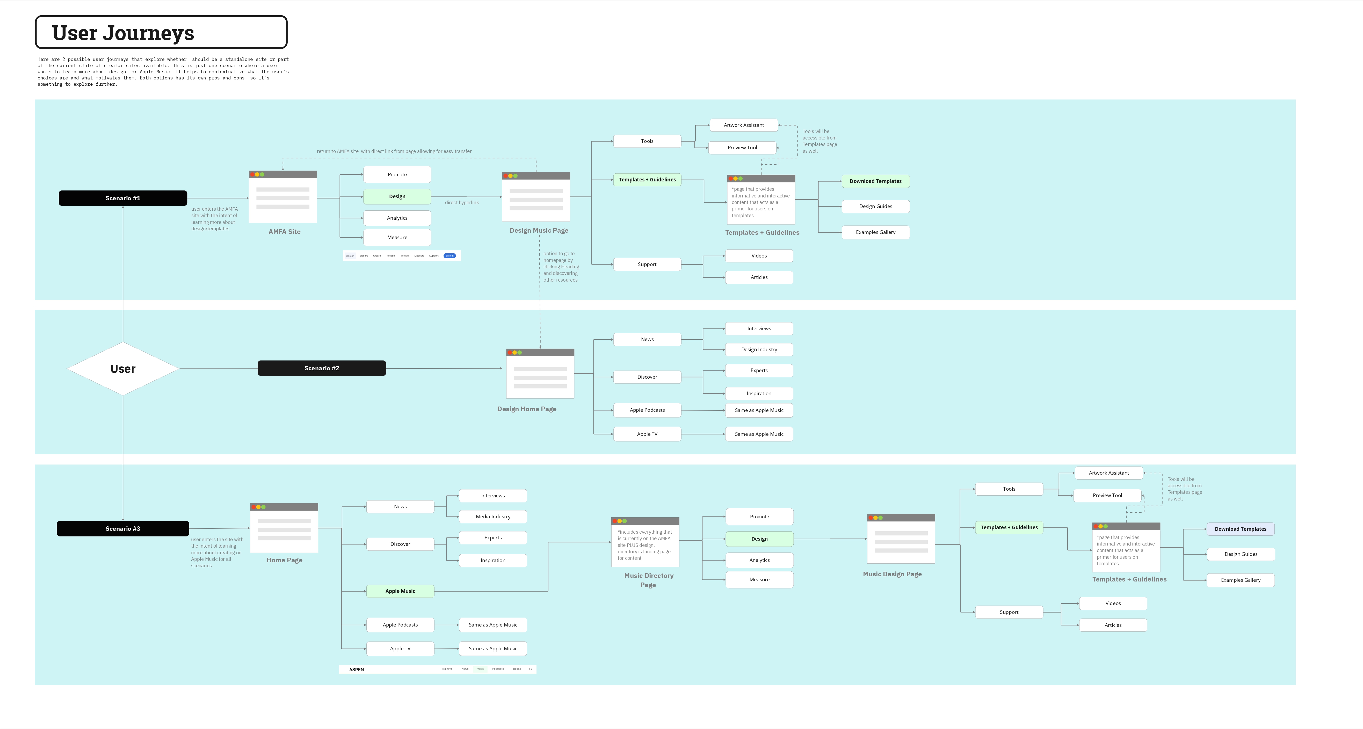
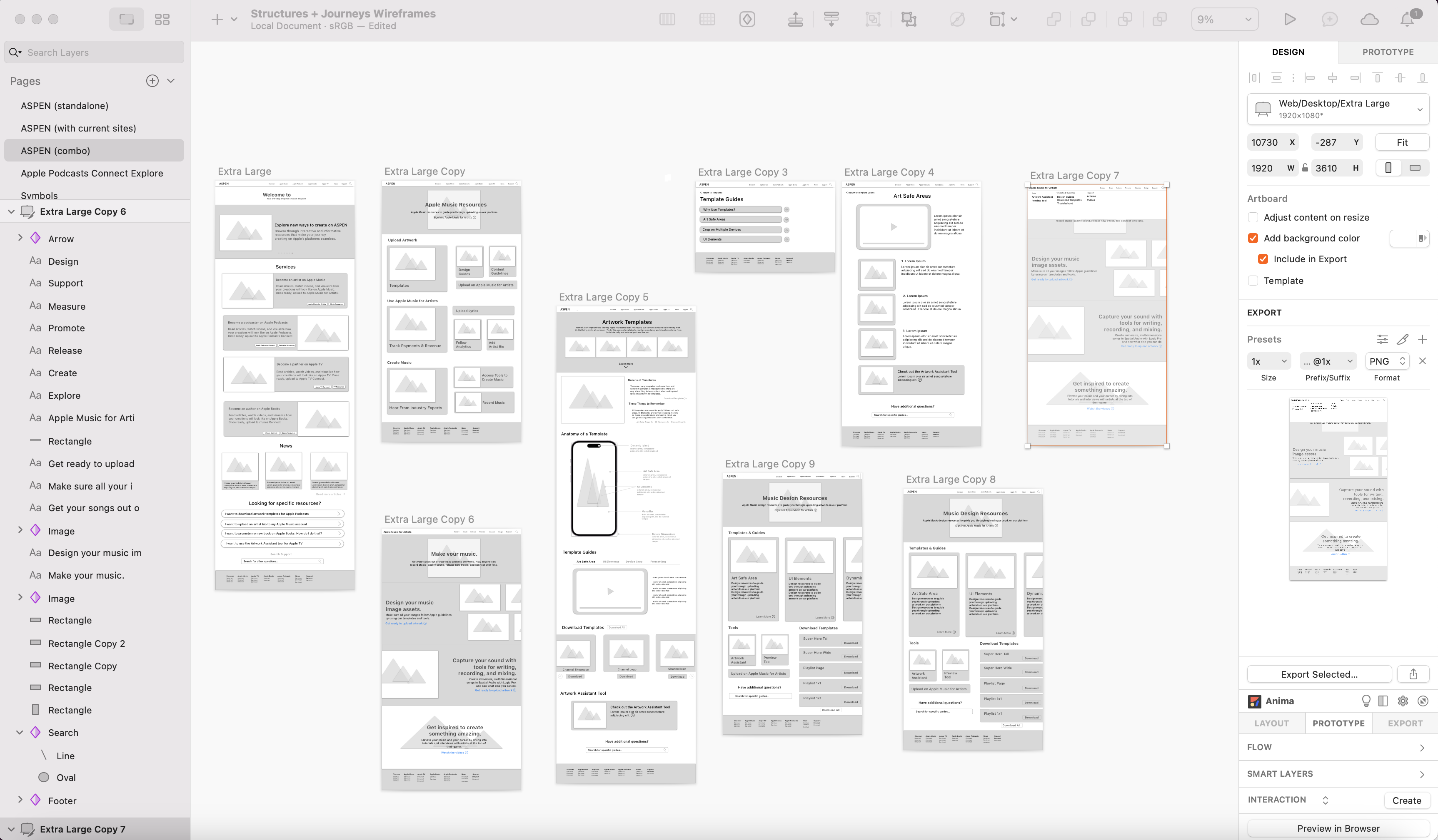
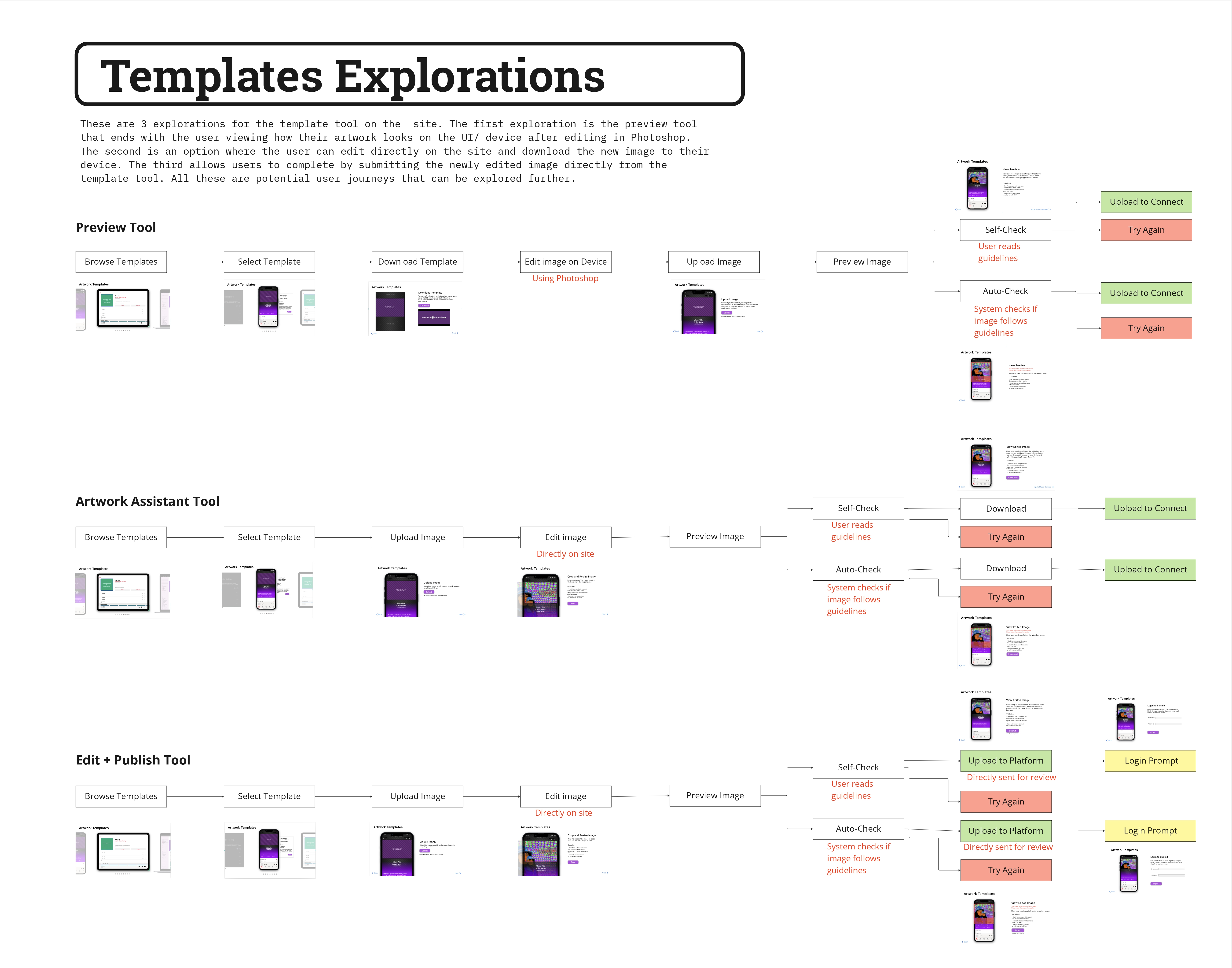
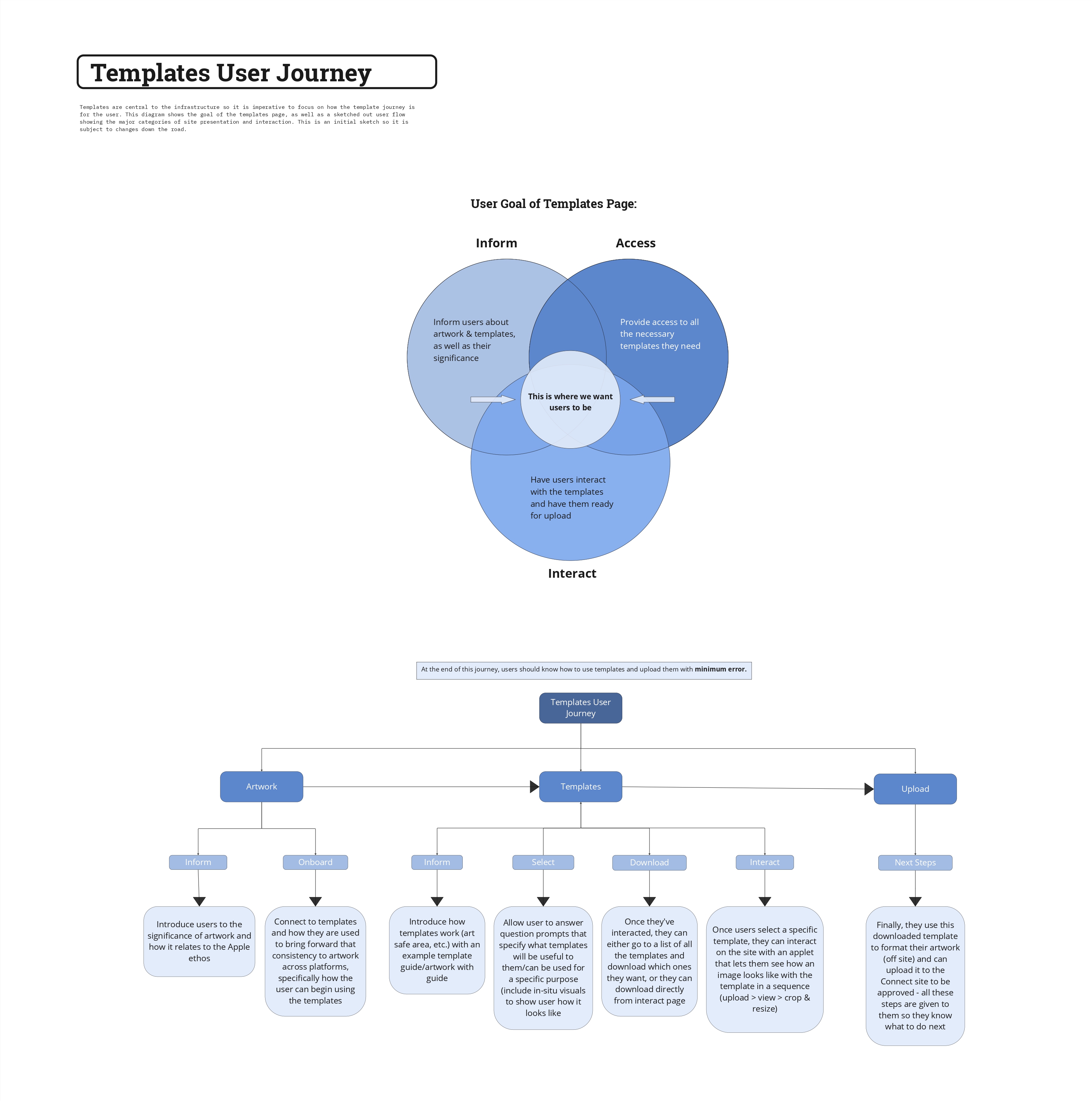
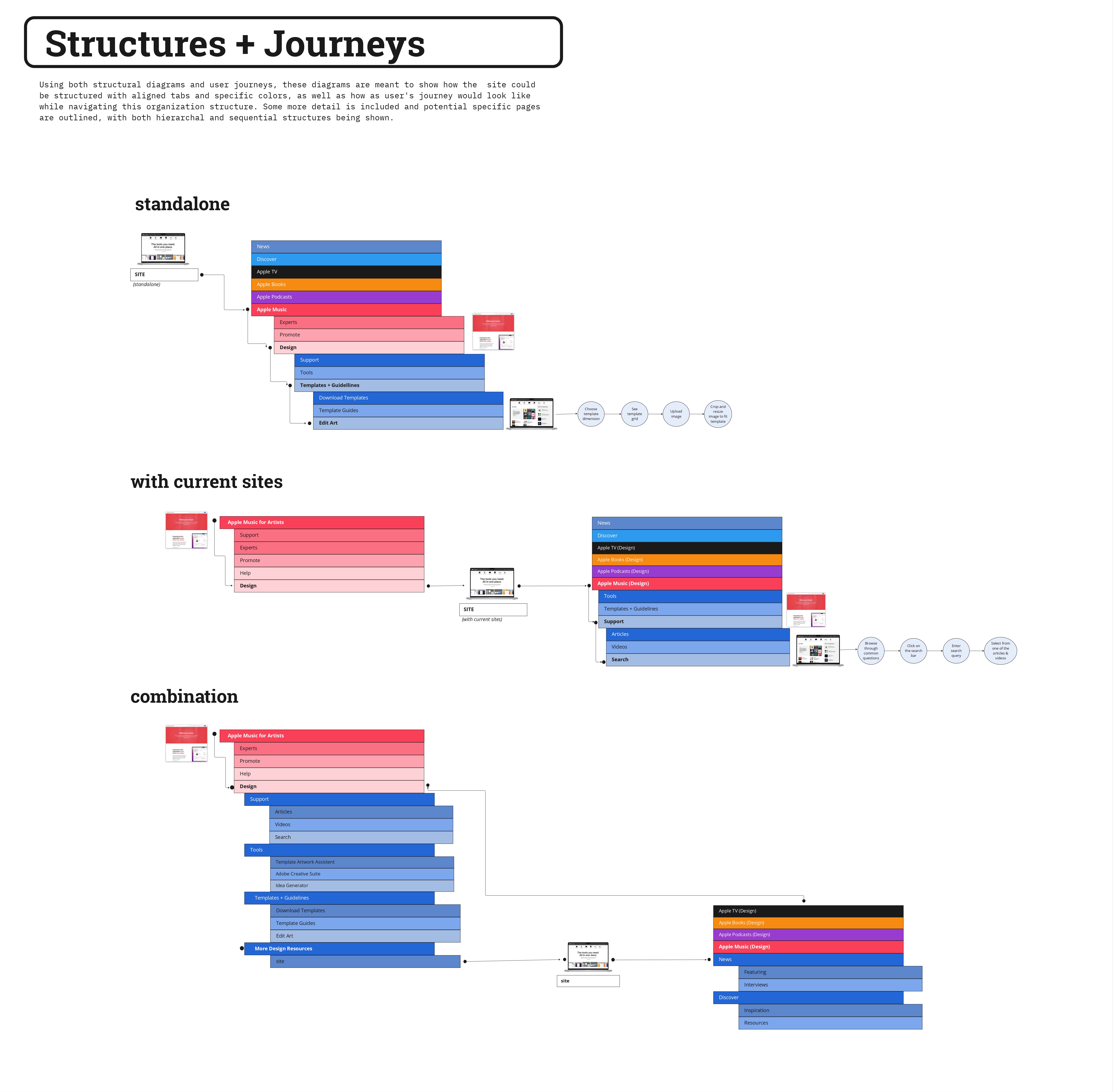
I did this by first performing an information audit on existing design guidelines, design content, and design templates. I then brainstormed mind maps & constructed hierarchical diagrams that visually presented content, informing any future information architecture explorations. After that, I created multiple user journeys that navigated the potential structuring and layout of a web application/site. To visualize this, I built wireframes and interactive prototypes based on the user journeys and information audit.
Working with my manager and a team of designers, researchers, and product leads really enhanced my experience. I learned the value of others' ideas to make informed decisions. I also had the wonderful chance to present my work to senior leadership at Apple in a final Keynote presentation. They gave me great feedback and the foresight to look back at my work and see how it could go further.
Above it all, I learned about the importance of the user and how good design takes time: time to research, time to brainstorm, and time to adapt to our changing world.
